


A custom baseball cap is often the first branded item people notice, making logo placement just as important as the logo itself. The right placement can improve visibility, enhance brand recognition, and complement the cap’s construction, while poor positioning can make even a great design look unbalanced.
Whether you’re creating promotional merchandise, employee uniforms, retail products, or sports team headwear, understanding where to position your artwork is essential. This guide explores the most effective logo placement options for baseball caps, recommended sizing, and design tips to help you create professional-looking custom headwear that stands out and reinforces your brand wherever it’s worn.
Why Proper Hat Logo Placement Is Crucial for Your Brand
The success of a custom baseball cap isn’t determined only by the quality of the embroidery—it’s also determined by logo placement on baseball caps. Even the most professionally designed logo can lose its impact if it’s positioned incorrectly. Strategic placement improves visibility, creates balance, and helps your audience recognize your brand instantly.
It Increases Brand Visibility
A baseball cap naturally sits at eye level, making it one of the most noticeable pieces of branded apparel.
When deciding where to place logos on baseball caps, consider how people will view the cap most often.
- Front-center logos receive maximum visibility.
- Side logos create subtle premium branding.
- Back logos work well for secondary branding.
- Brim logos add a unique retail appearance.
Choosing the right placement ensures your branding gets noticed in everyday situations.
It Creates a Professional Appearance
Poor logo placement can make even expensive embroidery look unbalanced.
For example:
- A logo stitched too high may disappear into the crown.
- A logo placed too low may curve awkwardly with the visor.
- Oversized artwork can overwhelm smaller cap styles.
Keeping placement proportional to the cap creates a cleaner and more polished finish. If you’re designing branded headwear, professionally made custom baseball caps provide embroidery-friendly panels that help logos maintain their intended appearance.
It Strengthens Brand Recognition
Consistency is one of the biggest factors in successful branding.
Customers quickly recognize brands when every cap uses the same:
- Logo size
- Placement
- Thread colors
- Embroidery style
Changing placement between production runs creates inconsistency that weakens your overall brand identity.
It Works with Different Cap Styles
Not every baseball cap is constructed the same way.
For example:
- Structured caps provide a firm surface for larger front logos.
- Unstructured caps often suit smaller minimalist embroidery.
- Curved seams may require slight placement adjustments.
- Ventilation eyelets should never interfere with important design elements.
Understanding the cap’s construction helps determine the ideal embroidery location.
It Improves Long-Term Wearability
Proper placement isn’t only about appearance—it also affects durability.
Logos placed over heavy seams, folds, or difficult construction areas may experience:
- Uneven stitching
- Distortion
- Increased thread stress
- Reduced embroidery lifespan
Positioning the artwork on the flattest embroidery area helps preserve both stitch quality and logo clarity.
It Supports Different Branding Goals
Different placements communicate different branding styles.
- Front center: Maximum visibility for company logos.
- Side panel: Lifestyle and fashion branding.
- Back arch: Secondary logos, slogans, or websites.
- Side embroidery: Employee names or special collections.
Selecting the appropriate placement allows your baseball cap to align with its intended purpose.
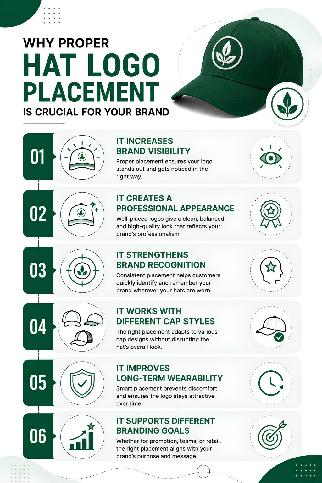
Ultimately, successful logo placement on baseball caps is about combining visibility, balance, consistency, and practicality. By carefully deciding where to place logos on baseball caps, businesses can transform ordinary headwear into a powerful branding tool that customers will notice—and remember.
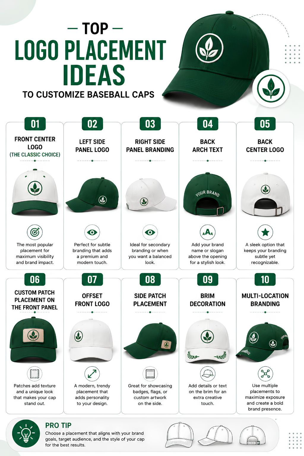
Top Logo Placement Ideas to Customize Baseball Caps
Choosing the right logo placement on baseball caps can completely transform the look of your custom headwear. While the front center remains the most popular option, experimenting with different placements can help your caps feel more premium, fashionable, or unique. Here are some of the best placement ideas for different branding goals.
1. Front Center Logo (The Classic Choice)
The front center panel is the most recognizable location for branding.
Best for:
- Business logos
- Sports teams
- Corporate uniforms
- Promotional giveaways
Why it works:
- Maximum visibility
- Largest embroidery area
- Easy brand recognition
- Suitable for embroidery and patches
If you’re unsure where to place logos on baseball caps, this remains the safest and most effective option.
2. Left Side Panel Logo
Adding embroidery to the left side panel creates a subtle yet premium appearance.
Ideal for:
- Small icons
- Flag graphics
- Secondary branding
- Fashion collections
This placement complements a front logo without making the cap feel overcrowded.
3. Right Side Panel Branding
The right side panel is becoming increasingly popular among streetwear and lifestyle brands.
Popular uses include:
- Limited-edition graphics
- Collection names
- Event branding
- Sponsor logos
Using both side panels strategically can give your baseball cap a retail-quality finish.
4. Back Arch Text
Curved embroidery above the closure adds another branding opportunity without competing with the front design.
Common applications include:
- Company names
- Website addresses
- Team names
- Brand slogans
This is especially effective when someone is walking away, providing additional brand exposure.
5. Back Center Logo
Instead of text, some brands prefer a small embroidered logo positioned above the back opening.
This works well for:
- Minimalist branding
- Premium apparel collections
- Luxury fashion brands
- Small company emblems
Keeping the design simple ensures it remains readable despite the smaller embroidery area.
6. Custom Patch Placement on the Front Panel
Instead of direct embroidery, many premium brands now use custom patch placement on caps.
Popular patch types include:
- Leather patches
- Woven patches
- PVC patches
- Embroidered patches
Patches add texture and dimension while allowing intricate artwork that may be difficult to stitch directly onto the cap.
7. Offset Front Logo
Rather than centering the logo, some modern brands intentionally shift it slightly left or right. This creative approach works particularly well for:
- Lifestyle brands
- Outdoor companies
- Boutique fashion labels
- Limited collections
Offset branding creates a distinctive appearance while maintaining excellent visibility.
8. Side Patch Placement
Patches don’t always have to be on the front.
Side-mounted patches are increasingly used for:
- Collaboration collections
- Anniversary editions
- Event merchandise
- Sports tournaments
This placement offers a premium look without overpowering the main branding.
9. Brim Decoration
Although less common, the brim offers another opportunity for customization.
Popular ideas include:
- Small embroidered text
- Printed graphics
- Decorative stitching
- Collection numbers
Brim branding works best as a supporting design element rather than the primary logo.
10. Multi-Location Branding
Some brands combine several placement locations to create a fully customized cap.
A balanced combination might include:
- Front embroidered logo
- Left side icon
- Back slogan
- Interior label
- Side patch
The key is maintaining visual balance so the cap feels intentional rather than cluttered.
Tips for Creative Hat Branding
When exploring creative logo placement ideas for hats, keep these principles in mind:
- Prioritize readability over decoration.
- Scale logos according to the available embroidery area.
- Leave enough spacing from seams and eyelets.
- Use secondary placements to support—not compete with—the main logo.
- Keep branding consistent across all cap styles.
The best logo placement on baseball caps depends on your audience, branding goals, and overall design aesthetic. Whether you choose a bold front-center logo, subtle side embroidery, or custom patch placement on caps, thoughtful positioning ensures your custom baseball caps look professional, memorable, and aligned with your brand identity.
Standard Logo Sizes for Different Baseball Cap Placements
Choosing the right logo size is just as important as deciding where to place logos on baseball caps. A design that’s too large can appear cramped, while one that’s too small may lose visibility from a distance. Following standard sizing guidelines helps create balanced, professional-looking caps that showcase your branding effectively.
Front Panel Logo Size
The front center panel is the most common location for branding and offers the largest embroidery area.
Recommended size:
| Placement | Recommended Size |
| Height | 2–2.25 inches |
| Width | 3.5–5 inches |
The exact size depends on the cap style.
Structured baseball caps
- Can accommodate logos up to 2.25 inches tall.
- Ideal for bold company logos.
- Great for stacked typography and larger emblems.
Unstructured baseball caps
- Best between 1.75–2 inches tall.
- Lower-profile crowns suit wider, shorter logos.
- Better for minimalist branding.
For effective logo placement on baseball caps, always center the artwork between the front seams while maintaining a small clearance above the visor.
Side Panel Logo Size
Side embroidery adds a premium appearance without competing with the main front logo.
Recommended size:
| Placement | Recommended Size |
| Height | 1–1.25 inches |
| Width | 2–2.75 inches |
Side placement works well for:
- Company icons
- Small brand marks
- Social media symbols
- Flag graphics
- Limited-edition collections
This subtle branding option is increasingly popular for retail-style caps.
Back Logo Placement Size
The back of the cap is ideal for secondary branding or personalization.
Back Arch Text
Curved text above the closure is commonly used for:
- Company names
- Slogans
- Team names
- Website URLs
Recommended size:
| Placement | Recommended Size |
| Width | 4–4.25 inches |
| Height | 0.5–0.75 inches |
Keep lettering bold and easy to read.
Back Center Logo
A centered logo above the closure offers a clean finishing touch.
Recommended size:
| Placement | Recommended Size |
| Width | 2.5–3.5 inches |
| Height | 1–1.5 inches |
Simple logos perform best in this smaller embroidery area.
Patch Placement Considerations
If you’re using patches instead of direct embroidery, sizing rules remain similar, but custom patch placement on caps offers a little more flexibility because the patch already contains the finished design.
Common patch locations include:
- Front center
- Side panel
- Back center
- Slightly offset front placement for lifestyle brands
Leather, woven, PVC, and embroidered patches generally look best when kept proportional to the cap’s available surface rather than filling the entire panel.
Selecting the correct dimensions for each placement ensures your branding remains balanced, legible, and visually appealing. Whether you’re deciding logo placement on baseball caps or planning custom patch placement on caps, following standard sizing recommendations creates a polished look that enhances both brand recognition and product quality.
Logo Sizes and Placement Guide for Baseball Caps and Other Hat Types
While the front panel is the most common branding location, every hat style has its own construction and decoration area. Understanding logo placement on baseball caps and other popular cap styles helps ensure your design looks balanced, professional, and highly visible. Below is a quick guide to recommended logo sizes and placement for different hats.
Baseball Caps
Baseball caps offer the largest and most versatile embroidery area, making them ideal for company logos, sports teams, and promotional merchandise.
Recommended front logo size:
| Placement | Recommended Size |
| Width | 3.5–5 inches |
| Height | 2–2.25 inches |
Additional placement options include:
- Side panel: 2–2.75″ wide
- Back arch text: 4–4.25″ wide
- Back logo: 2.5–3.5″ wide
If you’re unsure where to place logos on baseball caps, the front-center panel remains the safest and most recognizable choice for business branding.
Dad Caps
Dad caps feature a softer, lower-profile crown than traditional baseball caps, so oversized logos may appear distorted.
Recommended logo size:
| Placement | Recommended Size |
| Width | 3–4 inches |
| Height | 1.75–2 inches |
Smaller embroidered logos, monograms, and minimalist branding work particularly well on custom dad caps because they complement the relaxed style without overwhelming the front panel.
Snapback Caps
Snapbacks usually have structured, high-profile crowns that provide excellent support for larger embroidery.
Recommended logo size:
| Placement | Recommended Size |
| Width | 4–5 inches |
| Height | 2–2.3 inches |
Snapbacks are well suited for:
- Bold brand logos
- Large text
- Sports teams
- Streetwear graphics
The extra crown height allows more vertical design space than most other cap styles. Explore more design possibilities with custom snapback caps.
Trucker Hats
Trucker hats feature a foam or structured front panel with mesh backing, making the front panel the primary decoration area.
Recommended logo size:
| Placement | Recommended Size |
| Width | 4–5 inches |
| Height | 2–2.3 inches |
Popular placement options include:
- Large embroidered logos
- Woven patches
- Leather patches
- PVC patches
Because of their large uninterrupted front panel, truckers are also excellent for custom patch placement on caps, especially when creating premium retail merchandise.
See available styles of custom trucker hats.
Flexfit Caps
Flexfit caps combine structured construction with a fitted appearance, making them ideal for clean, premium branding.
Recommended logo size:
| Placement | Recommended Size |
| Width | 3.75–4.75 inches |
| Height | 2–2.25 inches |
Since Flexfit caps do not have adjustable closures, the back of the cap provides additional opportunities for:
- Small secondary logos
- Company names
- Player numbers
- Custom initials
Their sleek design makes them especially popular for corporate uniforms and athletic teams. Browse premium Flexfit hats for embroidery-friendly options.
General Placement Tips
Regardless of hat style, follow these best practices:
- Keep logos centered between front seams.
- Leave approximately 0.5–1 inch above the brim.
- Avoid placing artwork too close to eyelets or seams.
- Scale the logo proportionally to the crown height.
- Use simplified artwork for smaller placement areas.
Selecting the appropriate size and placement for each hat style ensures your branding remains clean, readable, and visually consistent. Whether you’re deciding logo placement on baseball caps, planning where to place logos on baseball caps, or choosing custom patch placement on caps, matching your artwork to the cap’s construction will always produce the most professional result.
In a Nutshell
Choosing the right logo placement on baseball caps is essential for creating headwear that looks professional, enhances brand recognition, and delivers lasting visual impact. From front-center embroidery to side logos and custom patch placement on caps, every placement option serves a unique purpose.
Matching logo size with the cap style ensures a balanced and polished finish, whether you’re customizing baseball caps for corporate branding, sports teams, retail collections, or promotional events. By understanding where to place logos on baseball caps and following proven design guidelines, businesses can create custom hats that strengthen brand identity while leaving a memorable impression on every wearer.
FAQs
1. What is the best logo placement on baseball caps for business branding?
The front-center panel is the most effective location because it offers the highest visibility during face-to-face interactions. It’s the preferred placement for company logos, promotional merchandise, employee uniforms, and sports teams.
2. Can I put more than one logo on a baseball cap?
Yes. Many brands use a primary logo on the front, a secondary logo or icon on the side panel, and company text or a slogan on the back arch. Multiple placements should remain balanced to avoid a cluttered appearance.
3. Are embroidered logos or patches better for baseball caps?
Both work well depending on your design. Embroidery is ideal for clean, bold logos, while patches are better for intricate artwork, vintage branding, textured finishes, and premium retail-style caps.
4. What logo size works best for custom baseball caps?
Most front logos measure between 3.5–5 inches wide and 2–2.25 inches high. Smaller placements, such as side panels and back logos, require scaled-down artwork to maintain readability.
5. Does the type of baseball cap affect logo placement?
Yes. Structured caps support larger embroidery, while unstructured dad caps generally require smaller logos. Trucker hats, snapbacks, and Flexfit caps each have different embroidery areas that influence placement and sizing.
6. Where should I place a logo on promotional baseball caps?
For promotional caps, the front center remains the most effective location because it maximizes brand exposure. Side or back embroidery can be added for secondary branding or campaign-specific messaging.
7. Can logos be placed on the brim of a baseball cap?
Yes, although brim decoration is typically used for small design elements rather than primary branding. It’s most common on retail, lifestyle, and limited-edition custom hats.
8. How do I choose between side embroidery and back embroidery?
Side embroidery is better for icons, flags, and collection branding, while back embroidery is ideal for company names, websites, team names, or slogans. Your choice depends on your branding goals and the amount of information you want to display.